Color Psychology Principles: Science-Based Recommendations for Home and Garden Design
Have you noticed how in some rooms you immediately feel calm, while in others you become active and energetic? This is no accident - the colors around us significantly affect our mood, emotions, and behavior. In Estonian homes, where long winter months can be dark, skillful use of colors becomes especially important as a tool for creating well-being.
The Impact of Color Psychology on Our Mood
Colors have the ability to affect our brain and nervous system, creating different emotional reactions in us. These reactions are not random, but are based on both biological and cultural aspects.
Warm Colors - Energy and Activity
Red is an intense color that stimulates and excites. It accelerates the pulse and raises energy levels, making it suitable for use in rooms where active activities take place. In the kitchen, red can even stimulate the perception of tastes! For example, imagine a red accent in the kitchen that highlights the creativity of food preparation and stimulates appetite.
Orange is also energizing, but slightly softer than red. This color promotes communication and creativity, fitting well in living rooms or other social spaces. Orange creates a warm, friendly environment that encourages conversation and open communication - like the warm glow of a fireplace on a winter evening.
Yellow lifts mood and creates a positive atmosphere. Since this color is associated with sunlight, it is especially well-suited to the Estonian context, compensating for dark winters. Yellow is a good choice for the kitchen or dining room, where it stimulates both mood and appetite. Scientific research shows that the yellow color tone increases optimism and self-confidence.
Cool Colors - Peace and Relaxation
Blue is one of the most calming colors. It lowers blood pressure and slows breathing, creating an ideal environment for relaxation. Interestingly, blue color has been found to reduce appetite, so those on a diet should consider using blue in the kitchen. Think of a light blue bathroom - as if you were by the sea, where waves gently wash ashore.
Green is associated with nature and creates a sense of harmony. It is the least straining color for the eyes and works well in both bedrooms and offices where you need to focus. Green color creates a connection with nature even when you are in an urban environment - like a small oasis in the midst of a fast-paced life.
Purple combines the calming effect of blue and the stimulating effect of red. Darker purple creates a sense of luxury and elegance, while lighter purple (lavender) offers a calming atmosphere. Purple has historically been a royal color, bringing dignity and depth to a room.
Science-Based Recommendations for Home Color Harmony
Color psychology is not just theory - applying its principles at home can significantly improve our quality of life. According to research published by Editverse.com, colors directly affect our perception and emotional well-being.
Room-Specific Recommendations
Living Room - Choose colors that reflect the purpose of this room. If you use the room primarily for relaxation, blue and green tones are suitable. However, if you want to create an energetic and social atmosphere, consider yellow or warm orange. For example, a neutral base tone combined with brighter accent elements can create a balanced yet interesting environment.
Bedroom - Focus on calming colors such as blue, green, and gray. These colors promote sleep and quality rest. Avoid bright reds and yellows, which can interfere with sleep. Imagine a sea blue wall that calms the mind after a long day and creates the perfect mood for sleep.
Home Office - Choose colors that promote focus and productivity. Green is often a good choice because it is the least straining for the eyes. Yellow can also stimulate creativity and optimism. A desk in a green corner creates a balanced environment where thoughts flow freely, but focus is maintained.
Bathroom - To create a relaxing spa-like atmosphere, use blue or turquoise tones that connect us with water. The Kinnisvara24 blog offers more ideas on how to transform your bathroom into a cozy home spa.
Creating a Color Palette in Estonian Climate
The Estonian climate, where there is little daylight in winter, requires a thoughtful approach to colors. Here are some tips:
Optimizing Light - Use light tones, especially white and silver, to maximize available light and create an illusion of a more spacious room. Mirrors combined with light-colored walls can significantly increase the perceived light in a room.
Adding Warmth - Long winters can feel cold and gray. Warm tones such as creamy yellow, light terracotta, or warm beige bring warmth and coziness to the room. Imagine a warm cream-colored wall that feels like a sunbeam on a winter day.
Using Contrasts - To draw attention, use contrasting colors, such as darker tones around windows combined with whites. These contrasts help create visual interest even when it's a gray winter day outside.
Applying Color Psychology in the Garden
Colors also play an important role in creating atmosphere in the garden. When installing a greenhouse and designing gardens, it's worth considering the effect of colors.
The Effect of Garden Colors
Green - The primary color of the garden, creating a sense of natural connection and harmony. Different shades of green create depth and texture. Imagine plants with different green tones creating a multi-layered and rich environment.
Blue - Creates a calm, meditative atmosphere. Blue flowers or garden accessories can transform the garden into a peaceful oasis. A small path with blue pebbles or a corner with blue flowers can become the calming anchor of garden design.
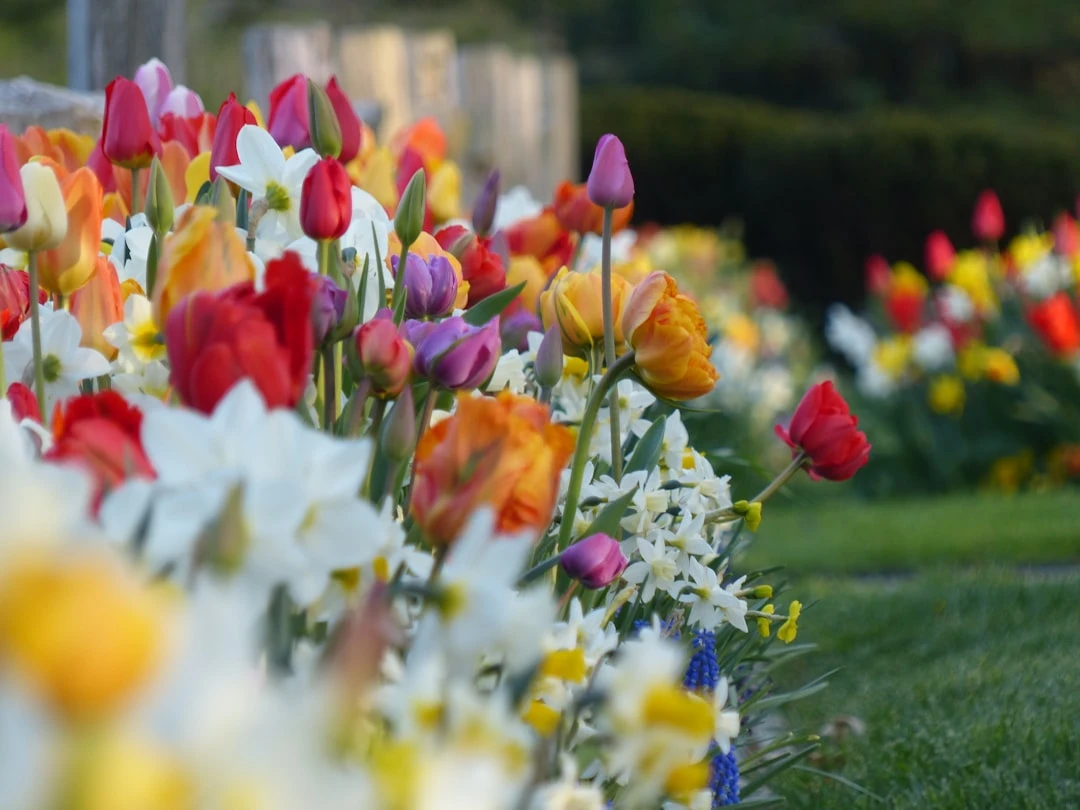
Yellow - Adds joy and energy to the garden. Yellow flowers attract attention and look like a good choice from afar. Sunflowers or yellow tulips bring optimism and cheerful energy to the garden.
Red - Creates dynamism and immediately draws attention. Red elements should be used in focal areas. A single red bench or a corner with red roses can quickly become the central eye-catching element of the garden.
Creating Harmonious Color Compositions in the Garden
Complementary Colors - Use colors opposite each other on the color wheel (such as blue and orange, red and green) to add drama. These combinations create dynamic tension and liveliness. For example, a combination of blue irises and orange lilies creates a breathtakingly beautiful view.
Analogous Colors - Colors adjacent to each other on the color wheel (such as red, orange, and yellow) create a harmonious and cohesive appearance. Such a combination looks calm, yet still visually interesting. Imagine a flower bed in warm tones that seems to echo a sunset.
Monochromatic - Different tones and shades of one color create a refined and elegant appearance. A "white garden" with different white and cream-colored flowers can be a stylish and timeless solution for any home garden.
Practical Aspects of Color Psychology
When applying colors at home and in the garden, practical considerations are also important:
Lighting and Color
Colors appear different under different light sources. Natural daylight shows colors most accurately, while artificial lighting can significantly alter colors. The use of solar panels in a private house can help optimize natural light.
One practical tip: before painting a wall, test the color tone in different lighting conditions - morning, day, and evening, in both natural and artificial light. The same green that seems refreshing during the day can become dark and oppressive under evening lighting.
Sound Insulation and Colors
Sound insulation is important for comfort and health. While sound insulation materials themselves are not directly related to colors, the right color choice can complement acoustic properties, creating an integrated environment.
The choice of color tone affects our perceived sound quality - soft, warm tones create a psychological impression of better acoustic properties, while cool, hard tones can create the impression of poor acoustics, even if the actual sound conditions are the same.
Color Schemes in Different Residential Spaces
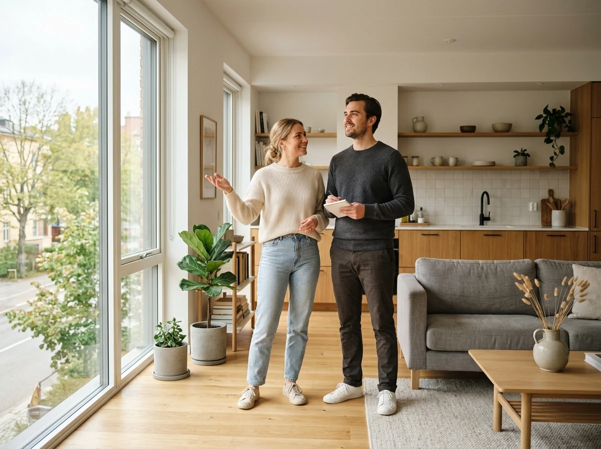
Color choices can differ depending on whether it is a rental apartment, a purchased apartment, or a private house. For rental apartments, more neutral colors that appeal to a larger number of people should be considered, while in your own home you can experiment more boldly.
If you plan to rent out an apartment, it's worth choosing universally appealing neutral tones that provide a good background for different interior styles. However, if you are designing a home for yourself, you can boldly express your personality. A private house also offers more freedom to create different character in different rooms - for example, you can use bold colors in the living room, while the bedroom is in calmer tones.
Summary
Color psychology provides a powerful tool for designing your home and garden in a way that supports our emotional well-being. Conscious color choice helps create an environment that stimulates or calms as needed, supporting our daily life and activities.
Especially in the Estonian climate, where the change of seasons brings significant changes in light and atmosphere, thoughtful use of color can significantly improve the quality of life in our home. Color is one of the few design elements that can be changed relatively easily and affordably, giving your home a new look and mood. Base your color choices on both scientific principles and personal preferences - ultimately, what matters most is that your home's colors create a sense of well-being in you and reflect your personality.
Search
Keywords
Most read articles
- Price per Square Meter of Apartments in Tallinn in 2025

- Estonian Apartment Prices and Market Expectations in 2025

- Apartment Market in Early 2026: Prices Rising, Transaction Activity Remains Modest
- Notary Fee and State Fee – Who Pays and How Much?
- The Apartment Market in Estonia's Largest Cities in 2025